SG Covid Case Clusters
Chi-Loong, Last updated 22nd June 2021
Feature updates
- 22nd June: Some tweaks on data structure. Small UI tweaks here and there. Likely final version.
- 20th June: Interface modified to show nationality, with data tab added. Force-diagram tweaks - cases banded by time (left to right) so that an intuitive understanding of the case structure is easier.
- 19th June: Can now search dataset and highlight cases by clicking on any category bin. Allows for easier analysis! E.g. click on vaccinated (2 doses) bar, and see that of this subset about 50% are asymptomatic and mostly above 50 years old (as of June 20th).
- 18th June: Historic version now available, separate from current live version which tracks the last 28 days of open clusters / cases.
- 14th June: Summary statistics now update depending on searched results. UI tweaks to make sure you can select/deselect search results. Allows for much easier analysis of search results!
- 13th June: Added summary statistics for all the categories, which serves as the new legend. As this is now all generated SVG, should look sharp on any screen device.
- 2nd June: Tweaked date color scale. Date scale now coded to emphasize MOH's calculation of when clusters are open (last 28 days where there is some activity). Cases / clusters older than 28 days removed.
- 1st June: Tweaked age color scale. Red-blue instead of spectral. Anything reddish is younger than 40, and anything bluish is older than 50.
- 30th May: Upgraded search function. Can search for occupation or organization, and highlights all results.
- 27th May: Asymptomatic data field added, with data tab added. Asymptomatic cases are often detected through surveillance / already quarantined.
- 26th May: Search feature added. Used to double check all open clusters listed in MOH annex and it is correct for this dataset.
- 24th May: Visualization launched.
Data updates, data sources and viz features
Data for the visualization only transcribed starting from April 28th 2021 (start of the TTSH cluster).
I will prune the dataset so that it will more accurately reflect what occurs in the open clusters (last 28 days without cases) so it is has less cases and is less cluttered.
Data will be updated whenever MOH releases the detailed case data, which tends to be late at night daily (typically after midnight).
For future work, the most important thing would be to update the data daily when it comes in.
I am grateful for all the comments, emails and suggestions but I beg your understanding that I am only one solo developer on this passion project. I still have a day job to do leh, so thank you for understanding.
Not only do I have to transcribe the cases, I often have to check the annexes and MOH siterep to see if there are reclassified cases.
Why create this visualization?
Because I felt we were missing a good dashboard for the public that gives us an intuitive insight into how the Covid cases are linked to each other.
Geospatial marker visualizations can be useful and can tell you where to avoid going during this period, but it does not give you a sense of how the cases spread and relate to each other.
The Ministry Of Health (MOH) Covid dashboard is good for summary statistics, but I would argue that it doesn’t do a great job in presenting how the cases spread visually.
A big kudos goes to them though for the amount of detail that goes into their daily press releases, which has detailed case notes for each community case that day.
Our media takes the data from here and covered stories on how the clusters grew, for example this detailed airport timeline by Channel News Asia (CNA).
They also did some nice non-interactive graphical tree charts just about a week back, but I think there may be too many cases to do this easily in a manual way going forward.
And here is where technology and a bit of manual data entry can help. By indexing all the recent cases and building a template dashboard, we can create a community case cluster graph visualization that:
- is far easier to update than manually drawing out the clusters
- allows us, at a glance, to intuitively get case relationship insights
- allows us to search and find each case by ID in the dataset (tedious and difficult on the MOH site).
- allows us to search and find cases via occupation or organization. E.g. searching "cleaner" highlights all cases tagged with "cleaner"
- shows summary statistics of all cases or a searched subset
- allows us to select a subset of a category more easily - a specific date, age band, etc. E.g. clicking the 30-40 bar under the "age" tab, it toggles the view for this specific subset.
Visual Insights: Vaccinated vs unvaccinated
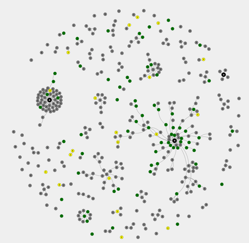
As of March 23rd 2020, we know that there are quite a bit more unvaccinated cases compared to vaccinated ones, according to CNA.
There are about 300 cases (79 percent) to 78 (21 per cent) that have fallen ill to Covid recently.
I could tell you all these numbers. But nothing brings this point across better than seeing it visually.

Yellow cases are those that are partially vaccinated (1 dose). Green cases are those that are fully vaccianted and have taken 2 doses.
Visual Insights: Date, age and gender
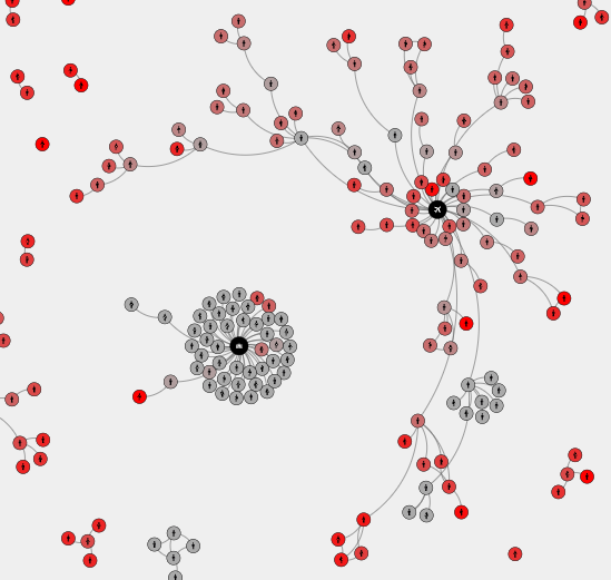
Why is the open airport cluster still a major concern? What does our biggest cluster look like?
Look at how long the chains are in the airport cluster. Compare this, for example, to the other big cluster case at Tan Tock Seng Hospital (late April /early May) which were quickly corralled and limited to mainly those with direct contact to Ward 9D.
Lastly, the latest leaf notes at the end of the airport cluster are still extremely recent, whereas the TTSH cluster has died out.

The redder the case, the more recent it is. Look at how the TTSH cluster is mostly old cases that all spread in one location, whereas the airport cluster has longer chains of transmission.
The learning point cluster, compared to the TTSH cluster, is also a great contrast
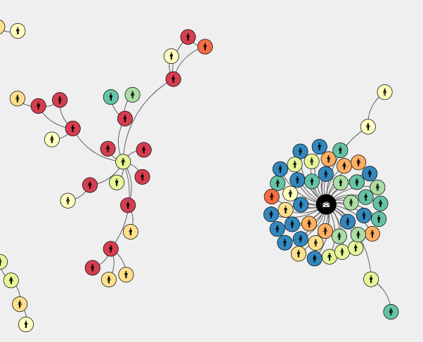
Take a look at the ages of the cases in the clusters!

Along a spectral rainbow scale, red denotes younger patients (10 years and below), whereas at the other extreme blue denotes old patients (80 and above).
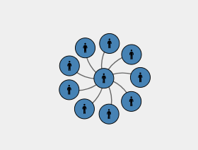
One last cluster I would like to point out is this prison cluster (as of 23rd May 2021). Notice anything?
Yup, all the cases in this cluster are all male.

All 10 cases in the prison cluster (as of 23rd May 2020) are male.
Shameless plugs
If you’re interested in visualizations in Singapore, check out viz.sg, the local data viz community website!
Also check out V/R, my visualization studio.
If you've read this far you might be interested in this virus simulation explorer that I wrote.
Join our local SG data viz meetup communities:
For those who are interested in the code, I've posted it to a public GitHub repo here.
Lastly, feel free to ping me on linkedin or drop me an email!